Form Designer
You can design main forms and activity forms through the Form Designer. The form designer has the following components.
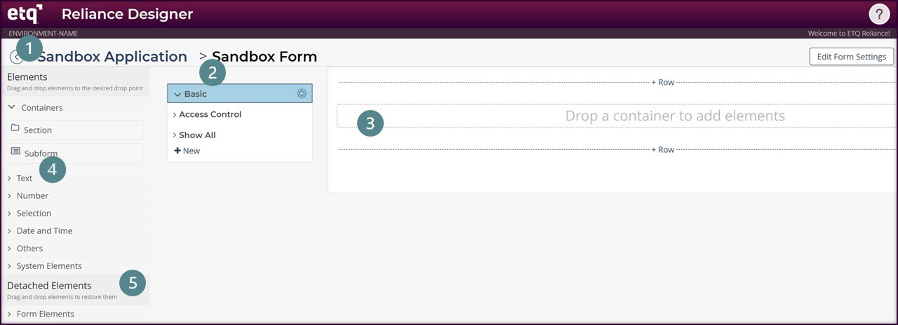
1. Go back to Application Designer
- Click on the back icon to close the form designer and go back to the application designer.
2. Add & Arrange tabs
- Click on the +New to add a new tab to your form.
- Re-arrange tabs by dragging the tab into another place.
3. Add a new Container
Form drops points allow you to add containers to empty rows. To add a container:
- Click on the +Row in the form area to add a blank row.
- Drag a container (Section / Subform) and drop it into a container drop point.
- Fill out the opened settings dialog of the created container.
- Click Apply & Close.
4. Add a design element to the container
- Drag an element and drop it into a container row. The element setting document opens.
- Fill out the Settings document and click Apply & Close.
Attachments, Links, Rich Text, External Links, and System sections elements can be added only to an empty row.
5. Detach Elements from Layout
- To detach any element from the form’s layout, click on the gear icon of that element and select Detach.
- You can add back a detached element by dragging and dropping it back to its parent Form/ Subform.
Gear Options
Gear options of the designer components contain the following tools.
1. Copy Design Name:
You can copy the design name to clipboard and paste it using the Keyboard paste shortcut (Ctr + V).
2. Edit Setting:
Select this option to open the component’s Setting Form.
3. Set Width:
You can set the width of an element within a Section container to up to 12 columns and within a Subform container to up to 10 columns. The Set width options will show columns options based on the empty columns available to the left side of the component and the width reserved by other components in the same row.
4. Set Visibility Rules:
Use this option to define the show/hide rules for components within a document.
- Click the Visibility Rule option listed in the gear menu of the component to apply a show/hide rule on this component.
- In the Visibility Rule dialog, select an existing Visibility Rule from the list or create a new one by clicking the +New action.
- When you create a new Visibility Rule, fill in the Rule Name and Edit When & Read-only When details.
- Each rule has a section setting created in the back-end by the system and all the section settings are displayed in the Visibility Rules\By Name view of the Reliance Engine application in read-only mode.
- Click on the Edit action next to the selected non-core Visibility Rule if you need to edit the Rule. Note that editing the rule will affect all other elements that use this rule.
- Click on the View next to the selected core Visibility Rule if you need to view it's details in read mode.
Consider that:
- You can add one Visibility rule for each element.
- Rules for Outer Sections are configured from the outer section’s settings.
- Elements within System Sections do not have Visibility Rules.
- You can view all visibility rules through ETQ Reliance Engine > Visibility Rules ViewVisibility Rules View.
Visibility Rules
Instead of navigating through every single component to see the visibility rules you have, you can search this view to see all visibility rules by the following available columns:
Visibility Rule
Element Name
Element Type
Parent Application
Parent Form
Date Modified
5. Detach:
Use this option to remove the elements from the document.
The detach option is not available for the Access Control tab.
Gear Options of Detached Elements
Gear options of detached elements contain two options: Copy Design Name and Edit Setting.
|
|
|