Reliance Charter
The charter reporting tool is specially designed to automate the creation of charts, which graphically depict the arrangement and relation of data. This tool helps decision-makers in tracking progress, isolating problems, comparing results and trends in data, and producing summarized and analyzed data.
The Charter reporting utility uses the Business Intelligence and Reporting Tool (BIRT). The charts are created based on any of ETQ Reliance application’s views or data sources.
Definitions
Axis: The line borders one side of the plot area, providing a frame of reference for measurement or comparison in a chart. For most charts, data values are plotted along the value axis, which is usually vertical (Y-axis), and the categories are plotted along the category axis, which is usually horizontal (X-axis). There are two types of y-axes: Primary Y Axis and Secondary Y Axis.
Chart Area: The chart area includes the entire chart and its elements.
Data Labels: Data labels provide additional information about data markers, which are single data points or values that originate from cells on the datasheet.
Depending on the chart type, data labels can show values, names of data series, categories, or percentages.
Data Series: A group of related data-points plotted in a chart. For charts with more than 45 series, color variation is applied only to the first 45 series, and then the same colors will be repeated for the next 45 series.
Grid lines: Lines you can add to a chart to make evaluating data easier. Grid lines extend from the tick marks on an axis across the plot area vertically and/or horizontally.
Legend: The legend identifies the patterns or colors assigned to the data series or categories in a chart.
Plot Area: The area bounded by the axis, including all the data series.
Title: Descriptive text that is automatically aligned to an axis or centered at the top of a chart.
Chart Types
Reliance Charter allows you to select the most suitable chart to illustrate your data in a comprehensible way. Below are the available chart types.
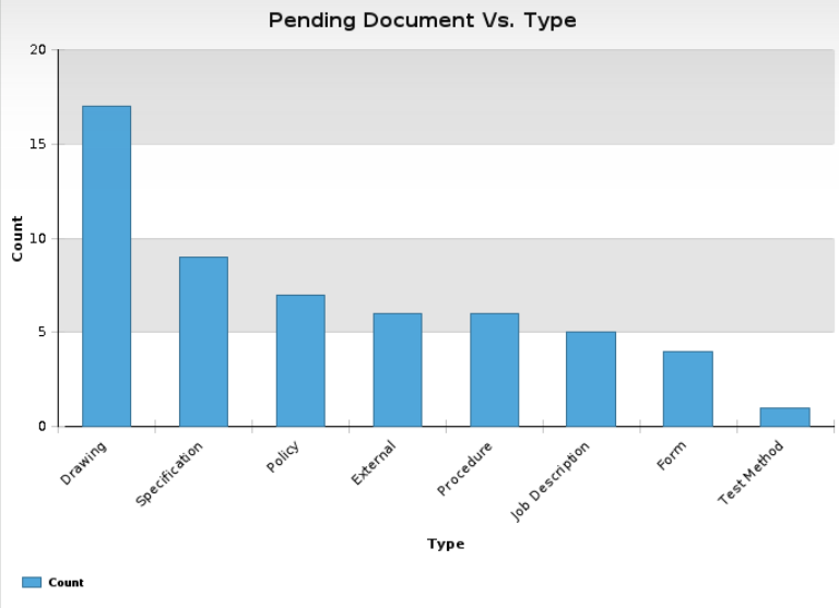
Column: A column chart is the default chart type. This chart type uses vertical bars to show the data plotted against x-axis and y-axis. One axis will show the categories, and the other will show the number value of that category.
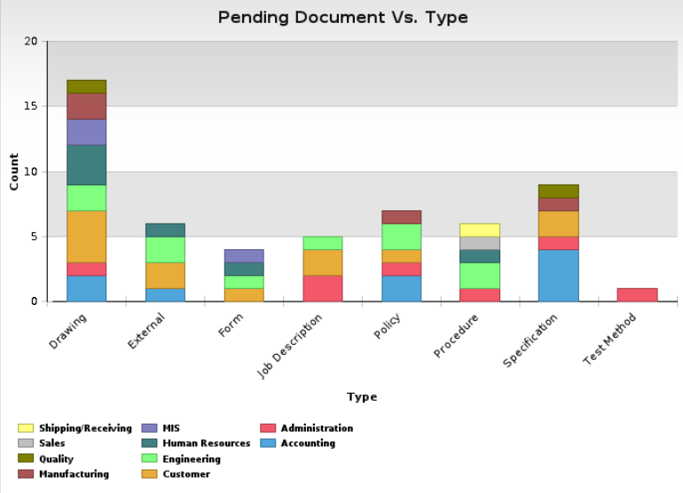
Stacked Column: This chart type shows the relationship of individual items to the whole.
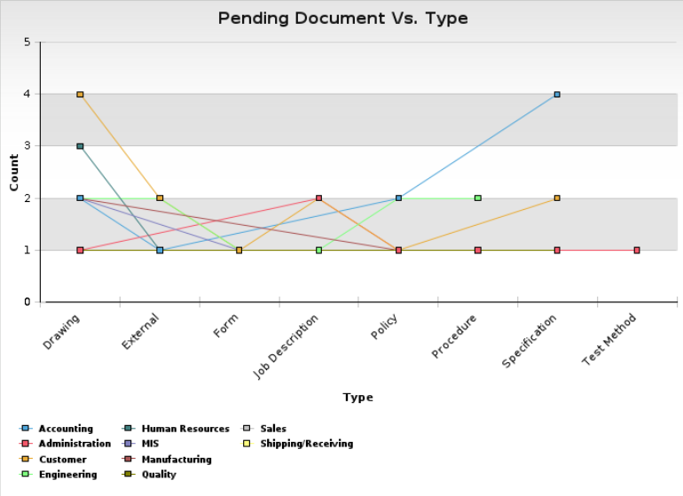
Line: A line graph is a way to summarize how two pieces of information are related and how they vary depending in relationship to one another. The numbers along the side of the line graph are called the scale.
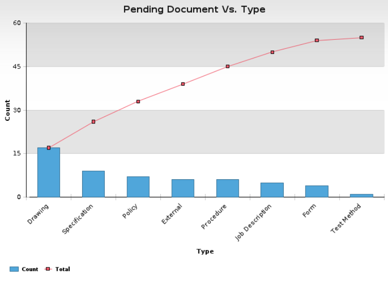
Pareto: A graphic representation of the frequency with which certain events occur. It is a rank-order bar chart that displays the relative importance of variables in a data set and may be used to set priorities regarding opportunities for improvement. The graph is accompanied by a line series that shows the cumulative totals of each category.
Bar: A bar chart shows the categories over data changes (e.g., periods). Categories are organized vertically, whereas values are organized horizontally.
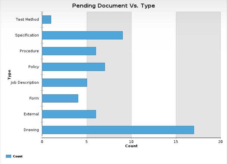
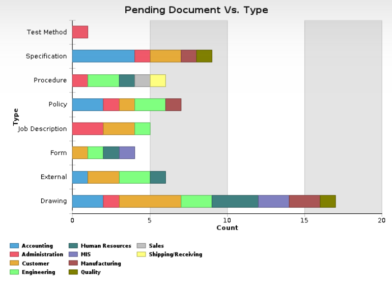
Stacked Bar: A stacked bar chart shows the relationship of individual items to the whole.
Pie: A pie chart is a circle graph divided into pieces that each reflect the size of related information. Pie charts display the sizes of parts that make up a whole.
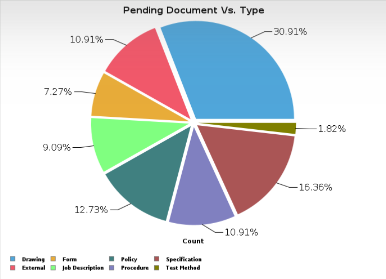
Note that the pie chart will not chart the data containing negative values in Chart Template, Chart Document, and Homepage. If the data includes negative numbers, you will be prompted with an error message stating that Pie charts do not support negative values upon previewing or saving the Chart Template.
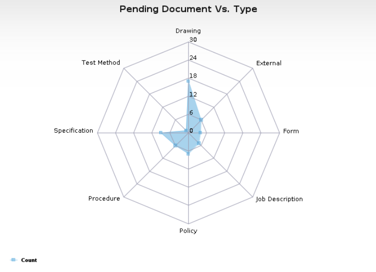
Radar: A radar chart, also known as a spider chart or star chart, or kiviat diagram, is a two-dimensional chart of three or more quantitative variables represented on axes starting from the same point. The relative position and angle of the axes are uninformative. Radar charts are usually used to compare the performance of different entities on the same set of axes.
Gauge: A gauge chart type represents a quantifiable measurement through the possible range displayed on a scale with a circular aspect. In addition, it contains a digital panel to display a numeric value.
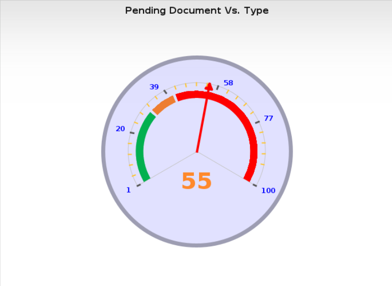
Chart Templates
The goal of the Chart Template is to save the chart definitions and parameters. Instead of redefining the parameters every time, you can create and save a Chart Template to be used by other users to create chart documents.
How to create a Chart Template for a Simple Chart?
To create a chart template for a simple chart:
- Click on New Document > Chart Template from the application toolbar. A chart template will be created.
- Fill out the Chart Template tab as follows:
Location(s): To assign the chart template for a specific location, select the template locations from the keyword dialog. By default, this field will be populated with the location of the template’s creator; however, you can select another location from the list available.
Chart Title: Enter a title for the chart template. This title will be the chart title when the chart is previewed.
Description: Describe the chart’s functionality, what the chart illustrates, and what the chart is used for.
Use: The data to be charted can be populated either based on a predefined data source or according to a certain view in any application.
Data Source: If you want to get data from a certain data source, select this option. This will show the Data Source field listing all data sources available in the system. Once you select a data source, the template will refresh to load the columns retrieved by the SQL script specified in the data source.
View: If you want to get data from a certain view, keep this option selected. This will allow you to chart the content of any view related to your Reliance licensed applications. A View field is displayed with this option so you can select the view/sub-view from which you want to get the data.
Category (X Axis): Use this field to select the categories of the x-axis from the selected view/data source columns. This field will be hidden when the chart type is set to Gauge.
Values (Primary Y Axis): Use this field to select the values you want to display on the primary y axis. Notice that this field lists only the numeric columns, including negative values, found in the view/data source you specified. In addition, the list always includes an option called Count. You can select this option when you need to chart the count of each category. If the chart type is set to Gauge, then the field will be replaced with the Value field, which accepts a single value.
Keep in mind that you can select only a single column in the ‘Values (Primary Y Axis)’ field in the following instances: when the Compare To field is populated, the Pareto chart type is selected, or the Enable Lower/Upper Control Limits (LCL/UCL) option is enabled.
Primary Y Axis Title: Use this field to specify the primary y-axis title to be displayed on the generated chart. If this field is left empty, but the Values (Primary Y Axis) field contains one value, then the primary-y axis title will display the name of the Values (Primary Y Axis) field value; otherwise, no title will be displayed.
- Save the chart template. The template will refresh, and a unique number will replace the ‘Please Save’ statement in the Number field.
The chart templates are listed in the Centralized Reporting application under 1. Charts/ 1. Templates in the following categories: Creator, Data Source, Data, Disabled, Homepage Profile, Title, Type, and View.
Example 1: Drawing a Simple Chart
To create a chart template to show the number of pending Document Control documents of different types, follow the steps below. The following table is an example of the pending documents by type that could be found in the Document Control application.
|
Workflow Type |
Count |
|
Job Description |
8 |
|
Drawing |
2 |
|
Form |
1 |
|
Policy |
1 |
|
Test Method |
1 |
|
Specification |
1 |
|
Procedure |
1 |
|
External |
1 |
- Create a new Chart Template from the application toolbar.
- Specify the Chart Title (e.g., No. of Pending Document Control Documents Against WF Type).
- Specify the Chart Type you prefer (e.g., Column).
- Select the Document Control: 1. Pending Documents: by Assigned view in the View field.
- From the Categories (X Axis) list, select the Type (ETQ_DOCWORK_WORKFLOW_NAME) column, and from the Values (Primary Y Axis) list, select the Count value.
- Save the chart template and then, click on the Preview Chart button. The chart will be generated at the bottom of the page, as shown in the image below:
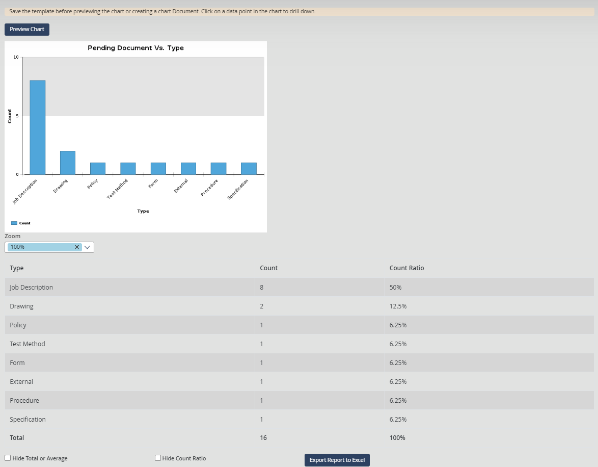
Notice that the maximum value on the Y Axis is the maximum value on the chart. A tooltip will appear with a description of the data used in this chart when you hover the mouse over the chart items.
Other elements are displayed along with the chart. They allow you to perform the following tasks:
You can click on any plotted data points to go to the view where these records are listed.
Using the Zoom options, you can zoom in to get a closer view of your chart or zoom out to see more of the chart at a reduced size. The behavior of the selected zoom option varies according to the selected chart type as follows:
For the Line, Column, Columns & Lines, Pareto, and Staked Column types, only the chart width is zoomed.
For the Bar, Stacked Bar, only the chart height is zoomed.
For the Pie, Radar, and Gauge, the chart height and width are zoomed.
Using the Export Report to Excel button, you can export the chart report to an excel sheet.
In addition, a chart report table is displayed at the bottom of the page to summarize the data. This table includes the selected values (y axis) columns, category (x axis) columns, and the ratio of each category. The report cells with no value remain empty, and the ratio is not calculated for negative value categories.
Note that the Hide Total or Average checkbox can be selected to hide the total/average row from the chart report if this row does not have any significant business value.
Display the Chart as 3D
To display the chart as 3D, select the Display Chart as 3D option in the chart template. Below is an example of a chart in 3D.
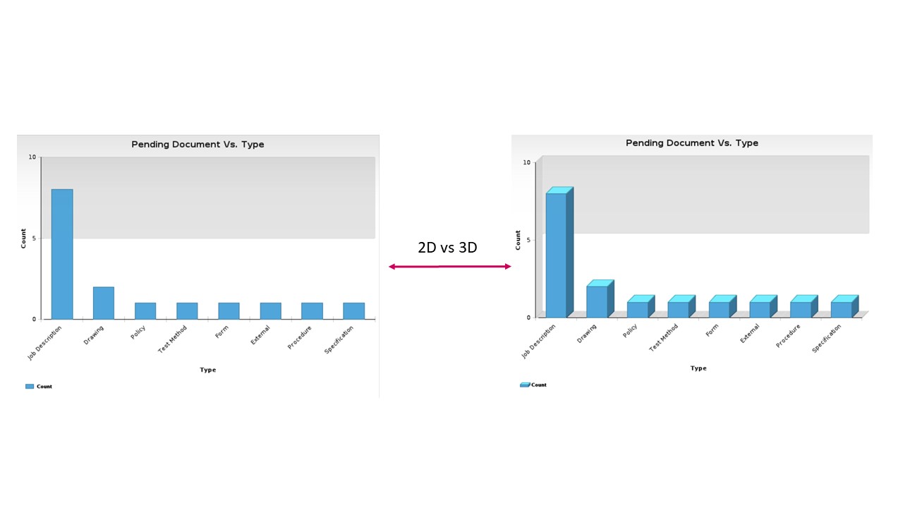
The Display Chart as 3D checkbox will be hidden if any Line, Gauge, or Radar type of charts are selected because they cannot be displayed as 3D.
Use Secondary Y Axis
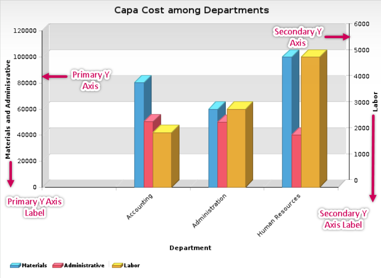
A chart contains two primary axes by default: Primary X Axis and Primary Y Axis, but in some cases, one y axis is insufficient. For instance, when charting two different value types in the same diagram, or when charting a series of significantly different ranges of values, the values with the smaller range might hardly be visible on the chart compared to those with wider range. The Labor values in the following chart demonstrate the need for more than one y axis.
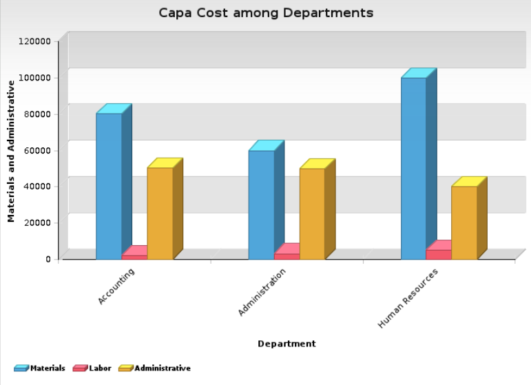
Using a Secondary Y Axis is allowed with the Column, Bar, Columns & Lines, or Line chart type. To add a Secondary Y Axis follow the steps below.
- Create a new Chart Template from the application toolbar.
- Fill in the Chart Title field with “CAPA Cost among Departments”.
- Select the Corrective Actions (CAPA/SCAR) : 1. Corrective Actions\6. Reports\Charting Views: Cost by Department view in the View field.
- Select Department (CAPA_COST_BY_DEPARTMENT_DEPARTMENT) in the Category (X Axis) field.
- Select the Use Secondary Y Axis checkbox. This will show the Values (Secondary Y Axis) and Secondary Y Axis Title fields.
- Split the values that you need to chart into two groups according to their ranges, then keep the value groups that have a similar range in the Values (Primary Y Axis) field and set the value with a different range in the Values (Secondary Y Axis) field. For instance, to amend the chart above, keep the Materials and Administrative in the Values (Primary Y Axis) field and add Labor to the Values (Secondary Y Axis) field.
- It is a good practice to title the primary and secondary y axis using the title fields. For instance, set the Primary Y Axis Title field to Materials and Administrative and the Secondary Y Axis Title field to Labor.
- Save the chart and click on the Preview Chart button.
If you leave the y axis unnamed, it will remain that way unless the value field has at least one value, in which case the y axis will be named after the first value. Accordingly, when the chart is re-generated, it will be displayed as illustrated in the figure below.
Exclude Repetitive Documents from Chart
Selecting the Do not chart repetitive documents option will count one record for each document regardless of its occurrences in the charted view. For instance, the documents/by assigned view shows a record for each assignee when the related document is assigned to multiple users. When a chart is generated to count the available documents in such a view, the same document will be counted for each user assigned to it, which gives misleading information. In this case, filtering the charted data using the Do not chart repetitive documents option will count only one record for each document and ignore the other repeated records.
Use a Compare To Value
Use the Compare To drop-down list to select the column that you want the category’s columns to be compared with. The Compare To list will only display the columns not selected in the Category (X Axis) field.
The Compare To field is required when you select Stacked Bar or Stacked Column charts. However, the Compare To field is not applicable to the Columns & Lines, Pareto, Radar, Gauge chart type, or when the Enable Lower/Upper Control limits (LCL/UCL) option is enabled.
Example 2: Usage of Compare To field
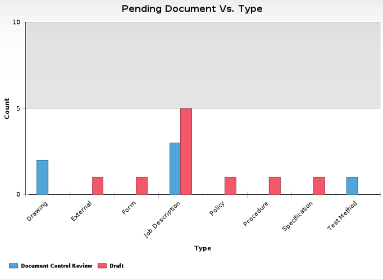
Adjust the chart template created in Example 1, to draw a chart that compares the workflow type and the current phase. Taking into consideration the documents’ current phases listed below.
|
Workflow Type |
No. of Documents |
Phase |
|
Job Description |
3 |
Document Control Review |
|
Drawing |
1 |
Document Control Review |
|
Job Description |
5 |
Draft |
|
Test Method |
1 |
Document Control Review |
|
Drawing |
1 |
Document Control Review |
|
Drawing |
1 |
Draft |
|
External |
1 |
Draft |
|
Drawing |
1 |
Document Control Review |
- Open the previously created chart template and adjust the Chart Title to reflect the new modification (e.g., change the chart title to No. of Pending Docwork Documents Against WF Type Compared with Current Phase).
- Select the Phase column from the Compare To field.
- Save the chart template and click on the Preview Chart button.
The chart will be displayed as in the figure below. Notice that each value of the Compare To field is drawn in a different color so you can easily classify the document type by current phase.
- Close the chart template without saving it.
Group Charted Data By Date
The Group Date by field will be displayed only if the first value specified in the Category (X Axis) field and/or the Compare To field includes a date column. You can set this field to group the charted data by Day, Week, Month, Quarter, or Year.
Example 3: Using the "Group Date by" field
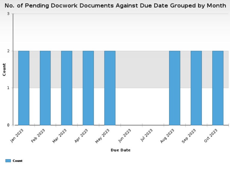
Adjust the chart template we have created in example 1 to draw a chart that shows the pending documents and their due dates. The charted data must be grouped by the month of the due date. Use the sample due dates below to create this chart.
|
Workflow Type |
No. of Documents |
Due Date |
|
Job Description |
2 |
Mar, 2023 |
|
Job Description |
2 |
Apr, 2023 |
|
Job Description |
2 |
May, 2023 |
|
Job Description |
2 |
Aug, 2023 |
|
Drawing |
2 |
Feb, 2023 |
|
External |
1 |
Jan, 2023 |
|
Form |
1 |
Jan, 2023 |
|
Policy |
1 |
Sep, 2023 |
|
Procedure |
1 |
Sep, 2023 |
|
Specification |
1 |
Oct, 2023 |
|
Test Method |
1 |
Oct, 2023 |
- Open the Chart Template and adjust the title to reflect the modification (e.g., change the title to No. of Pending Docwork Documents Against Due Date Grouped by Month).
- Clear the Category (X Axis) field and then select the Due Date column in it. The template is reloaded to display the Group Date by field.
- Select the Month value from the Group Date by field.
- Remove the selected option from Compare To field.
- Click on the Preview Chart button. The chart will appear as in the figure below.
Change the data Aggregation
The Aggregation field allows you to choose how to aggregate the y-axis values. There are two options for aggregation: Sum (the default value) and Average.
When the Aggregation field is set to Average, the result may include fractions. In this case, the result will be rounded to the nearest two decimal places. For instance, if the result for a certain value is 12.65896, the displayed data will be 12.66.
Notice that the Average option will not be available when the value field is set to count because the y value will always be 1.
Sort the Charted Categories
The Sort Order field allows you to select the order in which the categories will be displayed (ascending, descending, or no sort).
The Sort Order field does not work with the Compare To and Secondary Y Axis features. The Sort Order will be completely hidden when more than one value is specified in the Values (Primary Y Axis) field or when Chart Type is Pie, Pareto, or Gauge.
Other Options for Specific Chart Types
In addition to the fields we have already covered, certain chart types may show additional components as detailed below.
Columns & Lines: This chart type shows the Select values to display as Lines field listing the values of the Values (Primary Y Axis) and Values (Secondary Y Axis) fields. The value(s) you specify in this field will be drawn as a line(s), and the remaining Values of the primary/secondary y axis will be drawn as columns.
Gauge: The Gauge chart type does not have a report table. It shows the following components:
Minimum Scale Value: Use this field to determine the minimum value on the radial scale of the gauge chart.
Maximum Scale Value: Use this field to determine the maximum value of the radial scale of the gauge chart.
Gauge Color Ranges: Use this subform to define the radial scale ranges and their colors, taking the following rules into consideration:
Color ranges must not overlap.
The Minimum Value of a color range must not exceed the Maximum Value.
Example 4: Drawing a Gauge Chart
Draw a chart to show the number of pending CAPAs, knowing that the minimum number of pending CAPAs can be 0 and does not exceed 100. The chart must reflect the following details:
If you have 0–55 pending CAPAs, then the system status will be “Acceptable”. If you leave the minimum value field empty, its value will be inherited from the minimum scale value field, which is 0.
If you have 56–85 pending CAPAs, then the system status will be “Warning”. An investigation must be carried out to identify the problems.
If you have 86–100 pending CAPAs, then the system status will be in danger and immediate action must be taken. If you leave the maximum value field empty, its value will be inherited from the maximum scale value field, which is 100.
To create a chart with the above details, follow the steps below.
- Create a new chart template and specify a suitable title (e.g., Number of Open CAPAs), then set the chart type to Gauge. The template will refresh to display the fields and sections that are related to the gauge chart.
- Select the 1. Corrective Actions\ 1. Open : by Assigned view from the view field.
- Set 0 in the Minimum Scale Value field and 100 in the Maximum Scale Value field.
- Select the Count value from the value field. Remember that this field is set to accept a single value when the chart type is gauge.
- Keep the default Aggregation value.
- Add three records to the Gauge Color Ranges subform and fill them out with the information in the following table:
|
Description |
Minimum Value |
Maximum Value |
Color |
|
Acceptable |
0 |
55 |
Green |
|
Warning |
56 |
85 |
Orange |
|
In Danger |
86 |
100 |
Red |
- Save the Chart Template and then, click on the Preview Chart button.
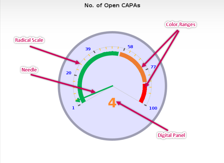
The chart will be drawn as in the figure below.
Gauge Chart Elements:
The figure above shows the following elements of the Gauge chart:
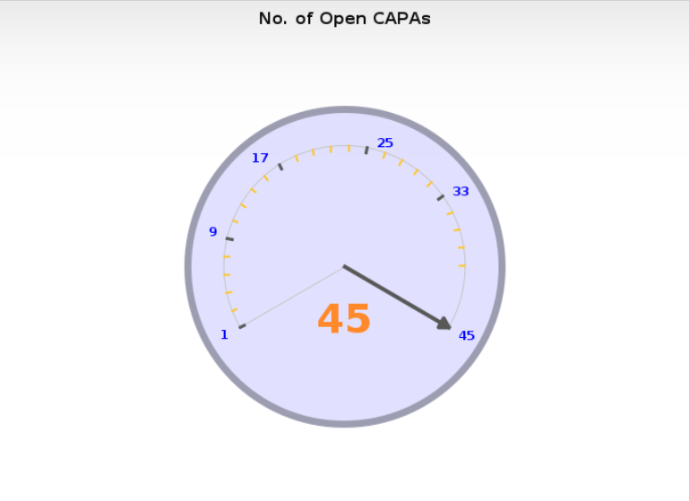
Radial Scale: Displays the range values. If the chart’s current value exceeds the maximum scale value, then the scale is adjusted to show that value as the maximum value of its range. The same applies to the minimum value. For instance, if a chart has 0 as a Minimum Chart Value and 40 as a Maximum Chart Value with no color ranges, but one of the values is 45, the chart will appear as in the figure below.
Color Ranges: Color ranges are sections that have different colors to reflect a specific description.
If you leave the Minimum Value field of the first record in the Gauge Color Ranges subform record empty, then its color will be extended backward within the gauge chart to match either the minimum scale or the chart result, if it is less than the minimum scale.
If you leave the Maximum Value field of the last range record empty, its color will be extended forward within the gauge chart to match either the maximum scale or chart result if it is more than the maximum scale.
Needle: The needle points to the current value of the value field. Notice that the needle color will change to the color of the range of the reading value.
Digital Panel: Displays numeric values on the radial scale.
Gauge charts have no legend. The gauge needle is the only clickable part of the chart.
Filter Charted Data
The Chart Template tab also includes the Enable Filters checkbox. This option will display the Filter Condition, Date Range Filter, and Locations Filter subforms through which you can the chart filters. The Show Filters Description in the Chart Image checkbox will be displayed and enabled by default, to show a description of the applied filters at the top of the generated chart.
Filter Condition
Use the Filter Condition subform to filter the records based on a specific field (e.g., Phase, Number…). You can use more than one record and combine them using the Logical Operator field which values are: AND and OR.
|
Logical Operator |
Field Name |
Comparison Operator |
Value |
|
N/A |
Assigned |
Equals |
John |
To Set a Filter Condition:
- Select the field of the records that will be filtered from the Field Name list. Note that if you are getting your data from a certain view, all the view columns will be displayed except the dates columns, which can be filtered using the Date Range Filter section.
- Select the operator that determines how the records will be filtered from the Comparison Operator list.
- Enter the value of your selection in the Value field. When setting filters for number fields, it is not recommended to use the Contains/Does not Contain comparison operators, as these operators will not retrieve the numbers that partially match the specified value. For instance, filtering for any figure that contains 50 will not retrieve 500 or 150 and so on.
To set another Filter Condition:
- Add a new record. The Logical Operator field will be displayed once you add a record to the subform.
- From the Logical Operator field, select the operator that will combine two filters. You can select one of the following two operators:
AND: This operator includes a record in the chart if both the first condition and the second condition are true. This means that only the documents that meet the two filtering criteria will be included in the chart.
OR: This operator means that any document that meets at least one filtering criteria will be included in the chart.
- Fill in the Field Name, Comparison Operator, and Value fields for the second filter as explained above.
- Click on the Preview Chart button to view the filtered data.
Example 5: Setting a filter condition
To set the filter to display only the documents in the draft phase, fill in the filters section as shown in the figure below.
|
Logical Operator |
Field Name |
Comparison Operator |
Value |
|
N/A |
Phase |
Equals |
Draft |
Example 6: Setting a filter using AND operator
To set the filter to display only procedure documents in the draft phase, fill in the filters section as shown in the table below.
|
Logical Operator |
Field Name |
Comparison Operator |
Value |
|
N/A |
Phase |
Equals |
Draft |
|
AND |
Type |
Equals |
Procedure |
Example 7: Setting a filter using AND and OR operators
When using both of these logical operators, keep in mind that the operator AND will always take precedence over the operator OR, (i.e., the filters combined with the 'AND' operator will be executed before the filters combined with the 'OR' operator). See the following example:
(Filter Record 1) AND (Filter Record 2) OR (Filter Record 3) AND (Filter Record 4)
Since AND takes precedence over OR, the filters will be executed in the following sequence:
[(Filter Record 1) AND (Filter Record 2)] OR [(Filter Record 3) AND (Filter Record 4)]
[Result of Filter 1 AND 2] OR [Result of Filter 3 AND 4]
Therefore, you should set your filters keeping in mind how these rules will affect your results.
For instance, assume that we have the following documents within the Document Control application:
|
Workflow Type |
Current Phase |
Document Location |
|
Procedure |
Final Approval |
Amman |
|
Procedure |
Draft |
Amman |
|
Procedure |
Draft |
NY |
|
Procedure |
Draft |
NY |
|
Form |
Document Control Review |
NY |
|
Form |
Draft |
Amman |
Case 1: Show the procedure or form documents that are from NY.
This can be translated to the following statement:
(Location = NY AND Type = Procedure) OR (Location = NY AND Type = Form).
The table below shows how to set the filters.
|
Logical Operator |
Field Name |
Comparison Operator |
Value |
|
N/A |
Location |
Equals |
NY |
|
AND |
Type |
Equals |
Procedure |
|
OR |
Location |
Equals |
NY |
|
AND |
Type |
Equals |
Form |
The filtered documents are shown in the table below.
|
Workflow Type |
Current Phase |
Document Location |
|
Procedure |
Draft |
NY |
|
Procedure |
Draft |
NY |
|
Form |
Document Control Review |
NY |
Below is the chart that is generated based on these filters.
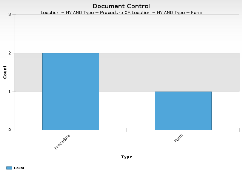
Note that the description of the applied filter appears at the top of the generated chart due to selecting the Show Filters Description in the Chart Image option within the Chart Information section.
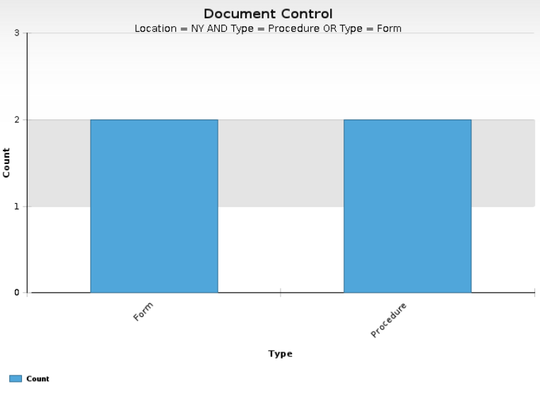
Case 2: Show the procedure documents from NY and all of the form documents.
This can be translated to the following statement:
(Location = NY AND Type = Procedure) OR Type = Form.
The figure below shows how to set the filters.
|
Logical Operator |
Field Name |
Comparison Operator |
Value |
|
N/A |
Location |
Equals |
NY |
|
AND |
Type |
Equals |
Procedure |
|
OR |
Type |
Equals |
Form |
The filtered documents are shown in the table below.
|
Workflow Type |
Current Phase |
Document Location |
|
Procedure |
Draft |
NY |
|
Procedure |
Draft |
NY |
|
Form |
Document Control Review |
NY |
|
Form |
Draft |
Amman |
Below is the chart that is generated based on these filters.
Example 8: Gauge Chart with Filter
Create a Gauge chart to show the number of pending CAPAs records in the Corrective Action application and apply a filter to get the pending CAPAs at the Initiate Phase and for the Engineering department. Follow the below steps to define the specification for the Gauge chart and filtration:
- Create a new chart template and specify a suitable title (e.g., Number of pending CAPAs in the Initiate phase for Engineering) then, set the chart type to Gauge. The template will refresh and display the fields and sections that are related to the Gauge chart type only.
- Select the Corrective Action (CAPA/SCAR) : 1. Corrective Actions\1. Open : by Assigned view from the View field.
- Set 0 in the Minimum Scale Value field and 100 in the Maximum Scale Value field.
- Select Count from the Value field.
- Keep the default Aggregation value.
- In the Gauge Color Ranges subform click on the Add Records button.
- The form is refreshed, and a new record is added to the subform.
- Add two more records and populate the subform as shown in the table below.
|
Description |
Minimum Value |
Maximum Value |
Color |
|
Acceptable |
0 |
55 |
Green |
|
Warning |
56 |
85 |
Orange |
|
In Danger |
86 |
100 |
Red |
- Select the Enable Filters checkbox. The form is refreshed to display the filter sections.
- Populate the Filter Condition section as shown in the figure below.
|
Logical Operator |
Field Name |
Comparison Operator |
Value |
|
N/A |
Phase |
Equals |
Initiate |
|
AND |
Department |
Equals |
Engineering |
- Save the template and click on the Preview Chart button. Below is the chart that is generated based on these filters.
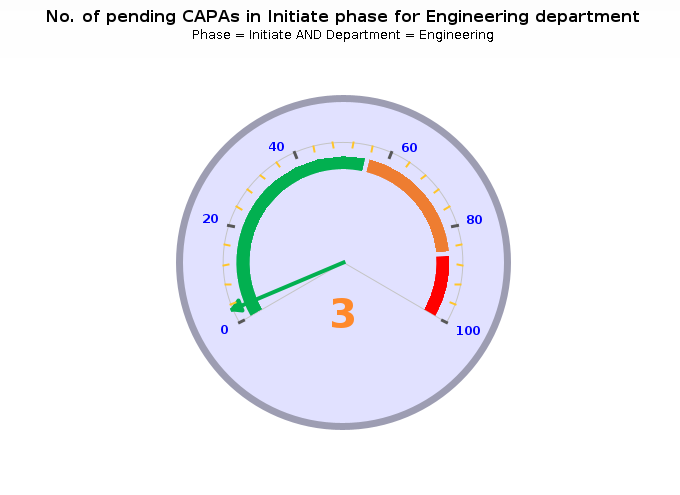
- Click on the needle in the gauge chart to see the corresponding filtered data.
Set a Date Range Filter
Using the Date Range Filter subform, you can generate a chart with data for the last year, last month, or even a specific time span.
The Date Range Filter subform can be set by selecting the date to filter from the Field Name field and specifying the date range Criteria.
The Field Name lists all date filters that are available for the charted data.
After selecting the date filter, refresh or save the chart template to display date range fields with labels based on the date filter. The label options are listed below.
Date From, Date To; if the filter is Date.
Time From, Time To; if the filter is Time.
Date and Time From, Date and Time To; if the field’s type is Date and Time.
The date range filter fields can be automatically or manually populated based on the specified Criteria. The criteria list contains the most common time spans, which are explained in the table below.
|
Criteria |
Definition |
|
Year to Date |
This is a period starting from the beginning of the current year and continuing up to the current date. For instance, if the current date is March 23, 2022 the date range fields will be automatically calculated as below. Field Name: Created Date Criteria: Year to Date Date From: Jan 1, 2022 Date To: Mar 23, 2022 |
|
Quarter to Date |
This is a period starting at the beginning of the current quarter and ending on the current date. For instance, if the current date is March 23, 2022 the date range fields will be automatically calculated as below. Field Name: Created Date Criteria: Quarter to Date Date From: Jan 1, 2022 Date To: Mar 23, 2022 |
|
Month to Date |
This is a period starting at the beginning of the current month and ending on the current date. For instance, if the current date is March 23, 2022 the date range fields will be automatically calculated as below. Field Name: Created Date Criteria: Month to Date Date From: Jan 1, 2022 Date To: Mar 23, 2022 |
|
Week to Date |
This is a period starting at the beginning of the current week and ending on the current date, where the week’s start day is determined based on the value configured in the "Week starts on" field of the Calendar tab > System Preferences. For instance, if the current date is March 23, 2018 (Monday) and the "Week starts on" field is set to Sun (i.e., Sunday) the date range fields will be automatically calculated as below. Field Name: Created Date Criteria: Week to Date Date From: Mar 22, 2022 Date To: Mar 23, 2022 |
|
Days to Date |
When this criteria is selected the Days field, which accepts only positive digits, will be displayed. This allows you to specify the number of days based on which the start date of the date range will be calculated back from the current date after you save the Chart Template. For instance, the date range will be automatically calculated as below if the Days to Date criteria is selected and the Date field is set to 15. Field Name: Created Date Criteria: Days to Date Days: 15 Date From: Mar 9, 2022 Date To: Mar 23, 2022 |
|
Last Year |
This is a period starting at the beginning of the last year and ending at the end of the last year. For instance, if the current year is 2022, then the date range fields will be automatically calculated as below. Field Name: Created Date Criteria: Days to Date Date From: Jan 1, 2021 Date To: Dec 31, 2021 |
|
Last Quarter |
This is a period starting at the beginning of the last quarter and ending at the end of the last quarter. For instance, if the current date is March 23, 2022 and we are currently in the third quarter, then the date range fields will be automatically calculated as below. Field Name: Created Date Criteria: Last Quarter Date From: Oct 1, 2021 Date To: Dec 31, 2021 |
|
Last Month |
Is a period starting at the beginning of the last month and ending at the end of the last month. For instance, if the current date is March 23, 2022, then the date range fields will be automatically calculated as below. Field Name: Created Date Criteria: Last Month Date From: Feb 1, 2021 Date To: Feb 28, 2021 |
|
Last Week |
Is a period starting at the beginning of the last week and ending at the end of the last week, where the last week is determined based on the value configured in the "Week starts on" field of the Calendar tab > System Preferences. For instance, if the current date is March 28, 2022 (Monday) and the "Week starts on" field is set to Sunday, then the date range fields will be automatically calculated as below. Field Name: Created Date Criteria: Last Week Date From: Mar 20, 2022 Date To: Mar 26, 2022 |
|
Date Range |
This is a period starting at the beginning of the date specified in the Date Time From field and ending at the end of the date specified in the Date Time To. By selecting this option the Date Time From /To fields will be displayed in edit mode allowing you to specify the date range as below. Field Name: Created Date Criteria: Last Week Date From: [ ] Date To: [ ] If one of the fields is left empty, it will be considered an open interval. For instance, if data is specified in the Date To field, but the Data From field is left empty, the date range will include any date until the date specified in the Date To field. |
Although the Date Range fields in the chart template are populated with static date values that are set to the date on which the chart template was created, the chart documents created accordingly will have the Date Range fields filled according to the specified date criteria, but with instantly updated date values.
Set a Location Filter
The Location Filter enables you to filter the charted data according to the location(s) in the chart template or in the generated chart documents in different ways.
For example, if our chart template is set to chart the number of complaint records in the draft phase, and we have 10 draft complaints at the USA : New York location and 5 draft complaints at the USA : Los Angeles location, then the chart will return the =numbers of draft complaints in the chart template and chart document. The filtered documents are shown in the table below.
|
Filter Option |
Template location is USA : New York |
Document location is USA : Los Angeles |
|
Document Location(s) |
10 |
5 |
|
Document Location(s) and Lower Location(s) |
10 |
5 |
|
Document Location(s) and Higher Locations |
15 |
15 |
|
Document Location(s) and Lower and Higher locations |
15 |
15 |
|
All document Locations (No Filter) |
15 |
15 |
Specify the filter option as either the document location alone or the location with lower, higher, or both locations.
Notice that selecting the All Document Location(s) (No Filter) option does not apply a location filter on the charted data.
The filter options will be transferred automatically to the generated chart documents and may be edited. You can select the Prevent modifications of these options in chart documents created from this template option to disable changing the location(s) filtering options in the generated chart document.
Make sure that the filter options defined for the selected view match the location(s) filters.
Draw Lower/ Upper Control Limits (LCL/UCL)
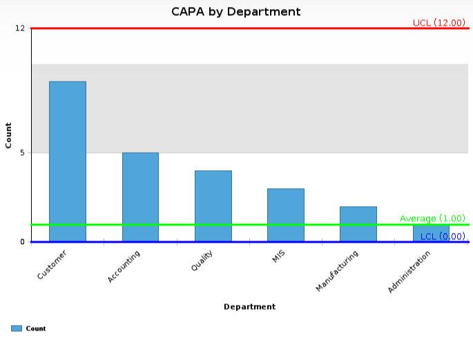
Select the Enable Lower/Upper Control Limits (LCL/UCL) checkbox if you want to draw the lower and upper control limits. By selecting this checkbox, the LCL/UCL Calculation section will be displayed. Notice that this checkbox will only be displayed for certain views and if the chart is either Bar, Column, Column & Lines, Line or Pareto, Stacked Bar, Stacked Column.
The LCL/UCL Calculation section will assist you in drawing the lower and upper control limits that indicate graphically whether the data is within or out of the control limits. This statistical model allows for rapid analysis and intervention for active processes.
Calculation Types: You can calculate the control limits manually based on your input or automatically based on a formula.
Manual: If you want to calculate the control limits based on your defined UCL / LCL values, then keep this option selected and populate the fields.
LCL Title: Enter the title of the LCL line. The default value for this field is LCL.
LCL Value: Enter the value of the lower limit that you want the samples to be evaluated against.
Average Title: Enter the title of the average line. The default value for this field is Average.
Average Value: Enter the average value you want the samples to be evaluated against. Note that if you leave this field empty, the average line will be hidden.
UCL Title: Enter the title of the UCL line. The default value of this field is UCL.
UCL Value: Enter the value of the upper limit that you want the samples to be to evaluated against.
Keep in mind that if the value of the LCL exceeds the value of the UCL a validation message will be displayed.
Calculated: If you want to calculate the control limits based on the formula LCL/UCL = C +/- 3 SQRT(C), then select this option and specify the following options:
Display Lines: Select which limit lines to display on the chart including LCL (Lower Control Limit), Average, and UCL (Upper Control Limit).
Period to use: Select one of the following date period to use:
Last Calendar Year: For this option the mean will be calculated starting from the beginning of the last year. E.g., today is August 12, 2012 so the mean should be calculated from the beginning of 2011 to today’s date.
Year-to-Date: For this option the mean will be calculated starting from exactly one year prior to the current date. E.g., today is August 12, 2012 so the mean should be calculated from August 11, 2011 to August 12, 2012.
Specific Period: For this option the mean will be calculated for a specific period of time. If selected the date from and date to fields will be displayed, allowing you to enter the appropriate time period.
Date Field: This displays all of the date and date and time fields for the parent form. Select the field to use the calculation based.
LCL Title: This is where you enter the title of the LCL line. The default LCL Title is LCL.
Average Title: This is where you enter the title of the average line. The default Average Title is Average.
UCL Title: This is where you enter the title of the UCL line. The default UCL Title is UCL.
Keep in mind that negative LCL, UCL, and average values will round up to zero.
Set Chart Document Location Options
The Chart Document Location Options section gives you different options to secure chart documents by setting a default value in their Location(s) fields. This is beneficial when a location filter is applied to the chart template/document. Location filters are enabled using the previously explained Location Filter section.
After changing the Chart Document Location Options, you will need to save the chart template for the selected option to become effective.
There are three options to set a default location for the chart documents:
Document location will match the user’s primary location: Selecting this option will set the Location(s) field within a created Chart Document dynamically according to the primary location of the user who has created it.
Note that the document location will match the user’s location. A location cannot be selected when scheduled reports are enabled within the Scheduled Reports tab of the Chart Template. This is because scheduled reports are always created by the system user which has no location.
Document location will match the Chart Template’s locations: Selecting this option will copy and transfer the location(s) in the chart template to the related chart documents.
Document location will match the selected locations: When this option is selected the chart template will refresh to show the selected locations, which includes all of the locations defined in the platform. When the location is set, the location(s) will be transferred to the field of created chart documents; regardless of the creator or chart template location.
Enable Scale Options
This option is displayed when the Category (X Axis) field has a date field. It is used to set an X-Axis scale for the charted values.
To use this option:
- Make sure that the Category (X Axis) field has a date field.
- Select the Enable Scale Options checkbox. This will display the Scale Option section with the date field set in read-only mode in the Category (X Axis) Scale field and the editable From and To fields.
- Set the From and To fields with the date range you want to define the X-axis scale start and end.
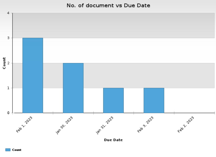
The below figure demonstrates the number of pending documents when the Enable Scale Options checkbox NOT selected:
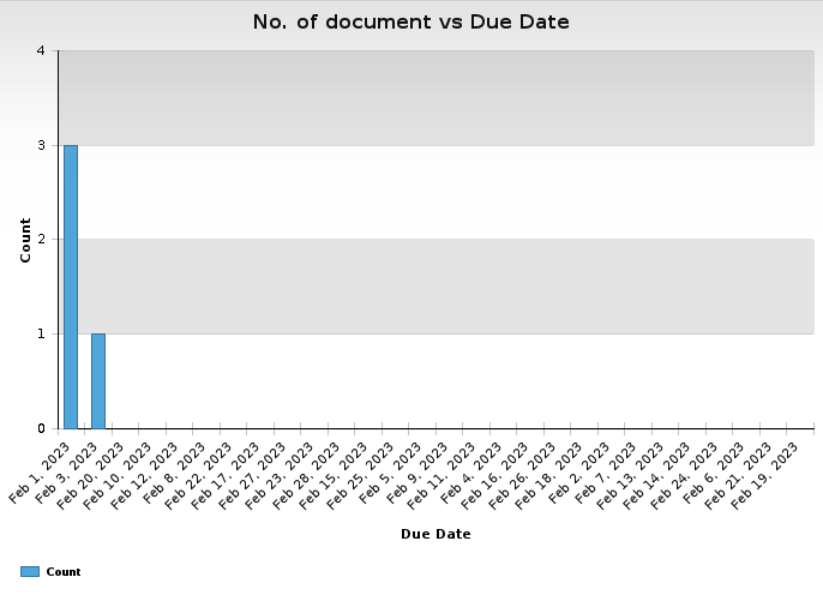
When the Enable Scale Options checkbox is selected, and the dates in the Scale Options section specified from Feb 1st to Feb 28th the diagram will be displayed as below:
Customize Chart Colors
Using default Centralized Reporting charting colors might not reflect the business colors of what is charted. For instance, it is common to use red for high-risk items; however, the Centralized Reporting charts sometimes use green.
The customize colors option allows you to reflect business color themes in the charts for the secondary\primary y axis values. However, when a compare-to value is set, chart color customization can only be set according to the compare to value.
For a better understanding of how chart colors can be customized, review the examples below.
Example 9: Customizing the Colors of Secondary\Primary Y Axis’s Values
The Corrective Action (CAPA/SCAR) : 1. Corrective Actions\6. Reports\Charting Views : Cost by Department (CAPA/SCAR) view of the Corrective Action and Preventive Action (CAPA) application charts the data along with the departments by their costs.
Chart Template: CAPA by Department vs. Costs
Chart Type: Column
Description: This chart shows departments and their costs for each CAPA record.
Use: View
View: Corrective Action (CAPA/SCAR) : 1. Corrective Actions\6. Reports\Charting Views : Cost by Department (CAPA/SCAR)
Category (X Axis): Department
Values (Primary Y Axis): Materials, Labor, Administrative
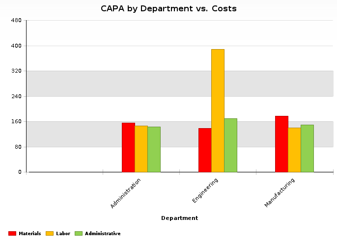
Once the template is complete, a chart will be generated as is shown in the figure below.
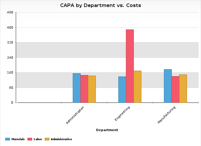
As you can see in the above figure, the cost for Materials presented in Blue, Labor presented in Red and Administrative presented in Orange.
The colors of the charted values can be customized by selecting the Customize Colors option. To change the colors so that the cost for Materials presented in Red, Labor presented in Orange, and Administrative presented in Green. In this case, the Chart Template will refresh to display the Customize Colors section with the Color Column Values subform, which contains a record for each value selected (primary or secondary).
This form allows you to set a color for each value in the chart. In our example, notice the colors set in the image. Once the template is complete, a chart with customized colors will be generated as shown in the figure below.
Example 10: Customizing the chart colors according to the Compare To value:
For each document listed, the Document Control: 1. Pending Documents: by Department view of Document Control application shows the Location, Department, Type and other information.
If this view is used to chart the pending documents by Location compared to their Department a chart template will open.
Once the template is complete, a chart will be generated as is shown in the figure below.
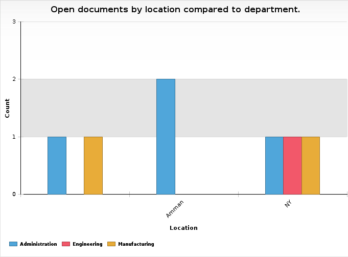
As you can see in the above chart, the pending documents are presented in the default colors: Blue for Administration, Red for Engineering, and Yellow for Manufacturing.
In order to customize colors on your chart instead of the default ones, select the customize colors option, which will refresh the chart template and display the Customize Colors section.
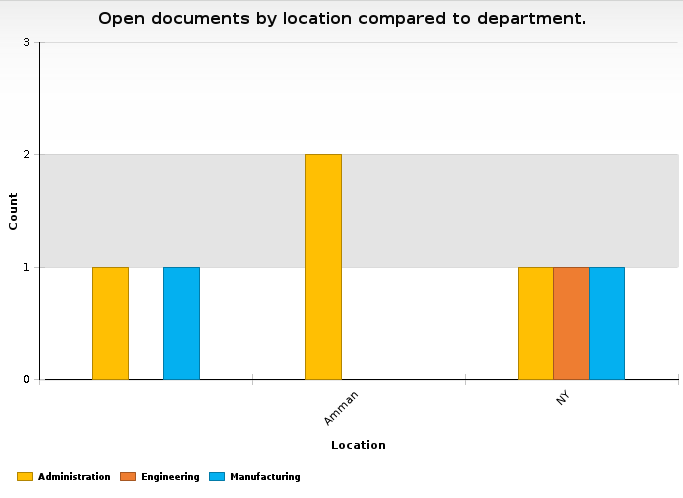
To define colors for specific department, select the Define Colors option. The Customize Colors section will refresh to display a subform with the following two fields: Compare To Value and Color. The Compare To Value field of this subform is case-sensitive. To change the colors so that the cost for Administration presented in Yellow, Engineering presented in Orange, and Manufacturing presented in Blue.
Once the Customize Colors section is filled in, click on the Preview Chart button to view the color customization in the chart. The figure below shows the chart for this example.
Example 11: Defining Colors for the Compare To Values Based on a Specific View-Column of Color Type.
The Corrective Action (CAPA/SCAR) : 1. Corrective Actions\1. Open : by Priority view of the Corrective Action application shows the Number, Due Date, Phase, Department, Priority, Location for each CAPA document. The priority color is created based on the color indicated in the priority color field which can be added to the CAPA.
For more information about defining color fields and color view columns, refer to the online help for field setting and column setting.
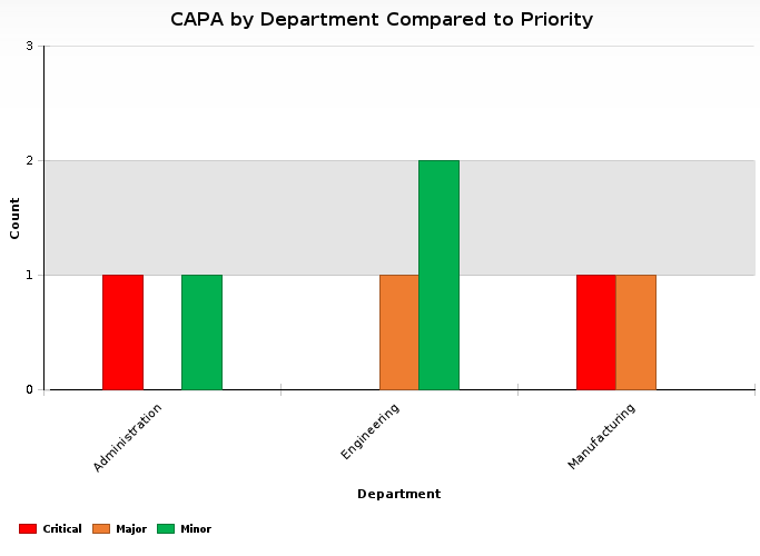
This view is used to chart the open CAPAs by department compared to priorities.
Once the template is complete, CAPA priorities will be presented in the default colors as shown in the figure below.
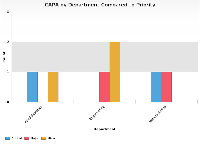
The document priorities for the open CAPAs are presented using the above colors.
To use the customize colors displayed in the priority color column on your chart instead of the default ones, first select the Customize Colors option. Then, in the Customize Colors section, select the Define Colors using View Column option. In this case, the Color Column field will be displayed listing all color columns available in the chart. In our example, this field will include the Priority color column.
Once the Customize Colors section is complete, click on the Preview Chart button to view the customized colors on the chart as shown in the figure below.
Enable Scheduled Reports
The scheduled reports tab is specially designed to schedule the process of creating the charts.
When scheduled reports are enabled, the location of the chart documents cannot match the user location. Scheduled reports are always created with system user that has no location.
To enable scheduled reports, select the enable scheduled reports box and fill in the following fields.
Every (in days) / For (in days): Use these fields to set the rate of recurrence at which the chart will be automatically created. For example, the above figure shows that the chart is scheduled to be created every 2 days for 100 days.
A task profile is available to control the scheduled charts. Task profiles are used to define and schedule a task according to the timing that you specify in the frequency field.
Online Distribution List: Select the users whom you would like to notify about the creation of a chart.
Notification Email Subject: Two options are available to create the notification email subject: EtQScript or Expression Builder.
When EtQScript is selected, a default script will be displayed for the subject of the e-mail. However, you can change or modify the script to meet your needs.
If Expression Builder is selected (default), you can specify the subject of the e-mail. You may customize the email subject by adding values using Insert field value.
Insert field value: This lists all fields that are available in the chart.
To customize the notification subject:
In the Notification Email Subject field, select the Expression Builder option and click on the Open Expression Builder button.
Place the cursor where you wish to insert the field’s value. (E.g., at the end of the sentence)
From the insert field value options, select the value you would like to display.
The field description will be added where the cursor is placed in the following format:
{etqfield:[Field Design Name] – Form (or Subform): Parent Form Design Name]}
Notification Email Body: Two options are available for notification email body: EtQScript or Expression Builder.
If EtQScript is selected, a default script will be displayed for the body of the e-mail notification. You can change or modify the script to fit your needs.
If Expression Builder is selected (default), you can specify the body of the e-mail notification. You may customize the email body by adding field values using the insert field value option.
Insert field value: This lists all fields that are available in the chart. To customize the body, apply the steps listed above for subject customization.
Drill Down through a Multi-Category Chart
Selecting more than one column in the categories (x axis) field will cause the chart to be organized in levels that provide a practical overview for users. To view the chart of any category, click on its related data. Typically, the chart levels will be sorted based on the order of the selected categories. Click on the last level of the graph to see its related view. Keep in mind that you will no longer have the ability to drill down to the related view after saving the chart document, nor you will you be able to drill down to the line series in a Pareto chart.
Example 12: Drill down through two categories
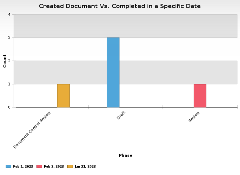
The Document Control : 1. Pending Documents : by Assigned view in the document control application includes the documents listed below.
|
Phase |
Type |
Due Date |
|
Draft |
Procedure |
Feb 1, 2023 |
|
Draft |
Form |
Feb 1, 2023 |
|
Draft |
Test Method |
Feb 1, 2023 |
|
Review |
External |
Feb 3, 2023 |
|
Document Control Review |
Policy |
Jan 31, 2023 |
Select the Phase and Type in the Categories (X Axis) field.
Select the Count value in the Values (Primary Y Axis) field.
Select the Due Date in the Compare To field.
Set the Day option in the Group Date by field.
Set the Sort Order field to No Sorting.
The chart will be generated as shown in the figure below.
The chart report summarizes the chart data, as shown in the figure below.
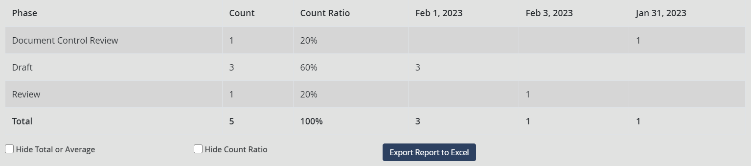
Remember that the ratio is not calculated for negative value categories. You can also select the Hide Total or Average box in the chart template and chart document to hide the total/average row from the chart report if this row does not have any business value.
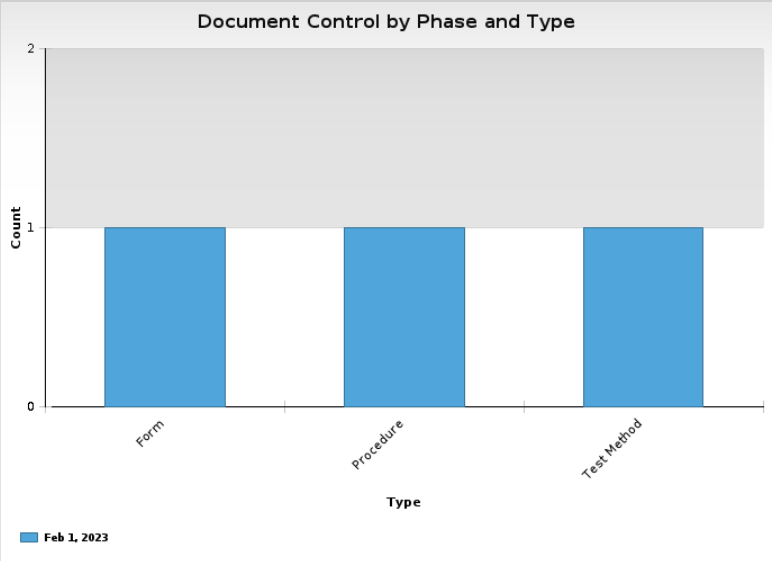
Click on the draft column in the chart area to drill down to the draft documents. The following will occur as a result:
The documents that are in the draft phase will be charted.
The second value specified in the Categories (X Axis) field will be used.
The chart will be re-charted as is shown in the figure below.
The chart report will summarize the chart data as shown in the figure below.
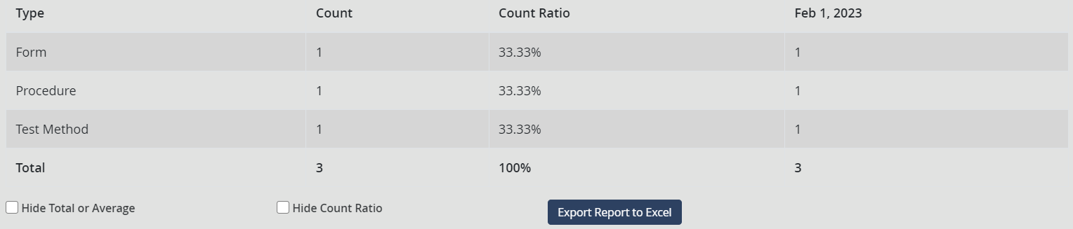
Click on the procedure column in the chart area to drill down to the procedure documents that are in the draft phase.
Chart Template Views
The chart templates that are available in the Centralized Reporting application under 1. Charts\ 1. Templates view category are sorted by Creator, Data Source, Date, Disabled, Homepage Profile, Title, Type, View.
Chart Documents
You can crate a Chart Document from a Chart Template to save a The chart documents are created based on the chart templates. These charts display the data in a chart.
Create a Chart Document
You can create a Chart Document from a chart template by clicking the Create Chart Document button.
Chart Document Contents
The Chart Document tab is specially designed to display the data that you wish to include in the chart. The values are inherited from the chart template and will appear in edit mode.
You can change some of the fields in the created document as you need, before you save.
After changing any of the options, click on the Recreate Chart button to refresh the chart. The zoom options, Export Report to Excel button, and the chart report will be displayed at the bottom of the chart as shown in the figure below.
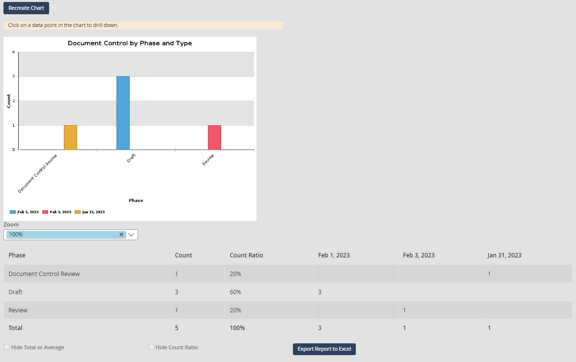
Chart Document Views
The chart documents that are available in the Centralized Reporting application under 1. Charts\ 2. Charts view category and are sorted by Creator, Data Source, Date, Title, Type, View.
|
|
|